context.
Gambling goes hand in hand with a lot of regulations that need to be met, therefore the registration process on gambling websites/apps can sometimes become a very extensive and clumsy process.
problem.
On our registration form we had about 16 fields without giving any guidance to the user on how to fill out the form, not clear or non-existing immediate error messaging and in general, was a very long process.
testing.
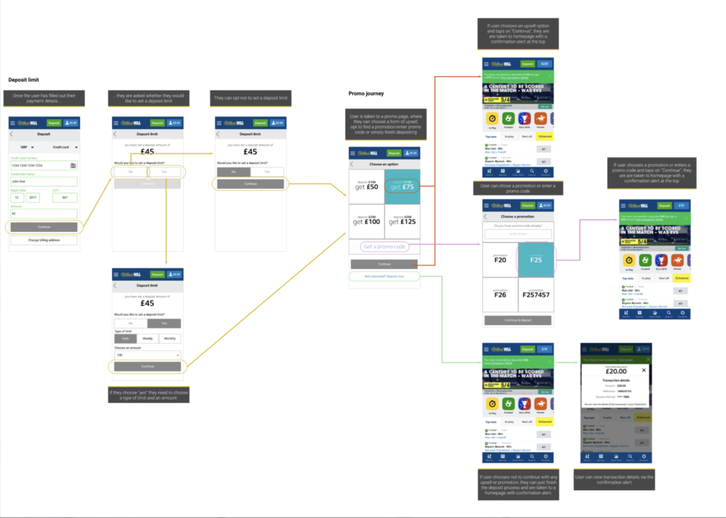
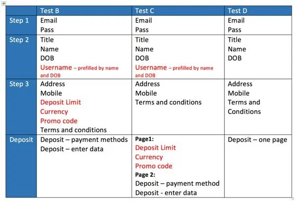
We started thinking about how we can develop an easier and smoother registration process. We wanted to test the current one-page registration form against a stepped registration process with improved error validation and help to message, also a different approach to the deposit journey.
Key items that we wanted to find out from this testing session:
- Which form performs better in terms of ease of use and clarity
- Would users prefer a one-page registration form or a stepped process?
- Do users need more guidance throughout the registration process?
- Do users acknowledge which fields are required and which are optional?
- What are their thoughts on stepped deposit as opposed to one deposit page?
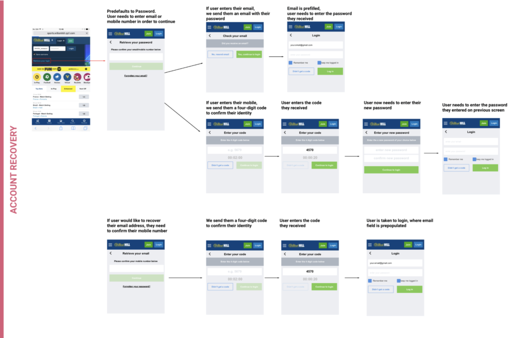
- Do users prefer to login with a username or an email address?
Test A ( Current registration form)
How do the users feel about registration being a one-page form?
What do they think about the design of the form?
What fields are they spending the most time on and why?
What fields are they having trouble with and why?
Would they rather log in using their username or their email?
Test B
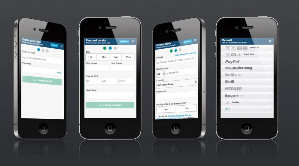
How do users find this type of stepped registration process?
Did they find the error validation, help messages, and hinting useful?
What were the problematic fields/areas here?
Test C
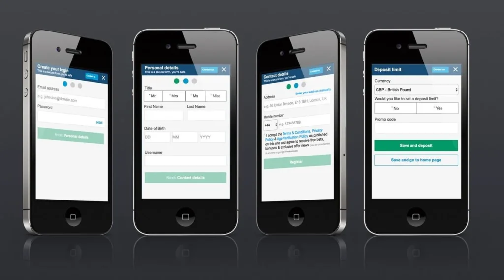
Taking deposit limit out of the registration means having an additional step, what are the users’ thoughts on this?
Would they deposit now or do it later?
Test D
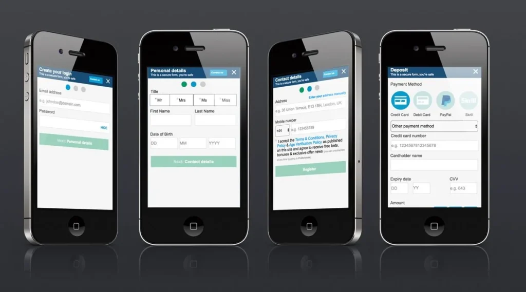
What are user thoughts on having no username?*
Introducing a new way to present promo code. Before was just a field now user needs to select if they have one or not. What are the users’ thoughts on that?
What do users think about the one-page approach for the deposit journey?
findings and solutions.
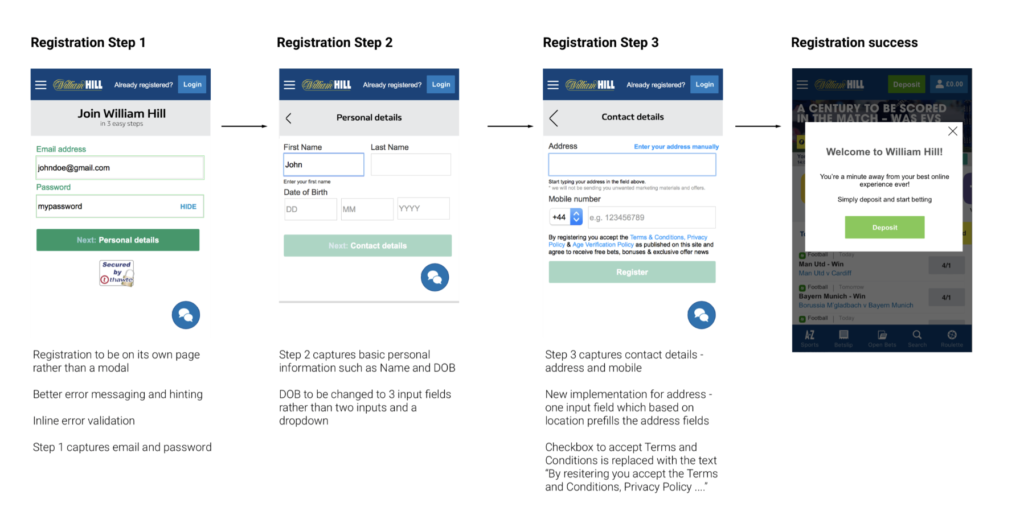
- The stepped process was easier as the user had to digest the information in small portions and it was clear what follows after the current screen.
Users wanted to be suggested a username.
Username suggestion had to be included
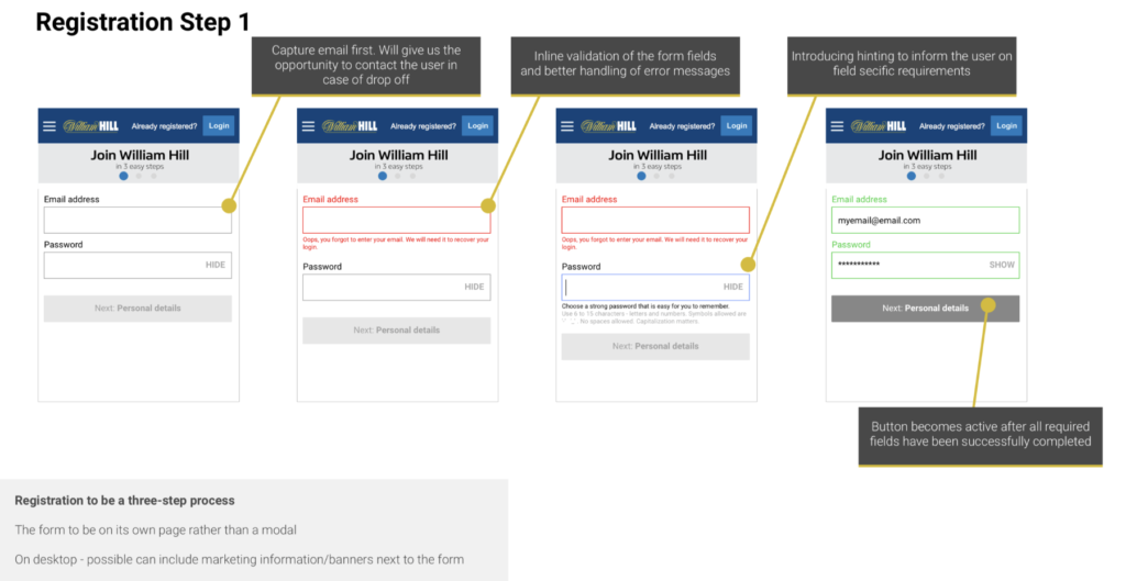
2. Error messaging had to be improved as were out of view when clicking Submit
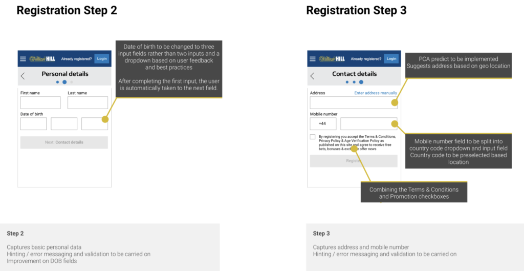
3. Date of Birth consisted of three fields – input for day, dropdown for month and input for year. Some users tended to miss the month drop-down when completing Date of Birth.
4. We knew we have to provide a better solution. Therefore come up with three input fields. As the user populates one cursor is automatic transfers to the next input.
5. We had to inform the user what are promo code and deposit limits as was unclear.
Error messages were too small and hard to read.
Error and hint messages had to be clear and visible.
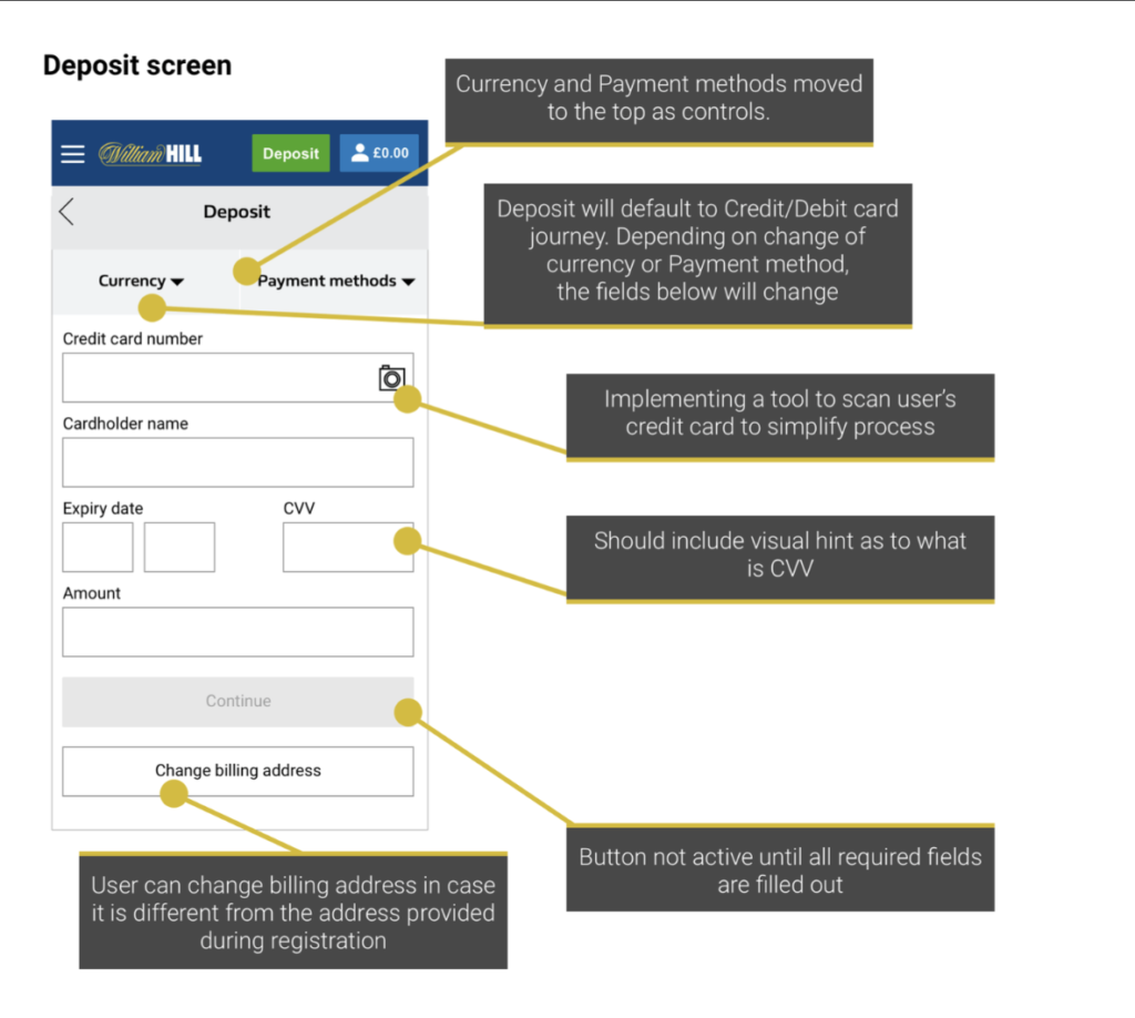
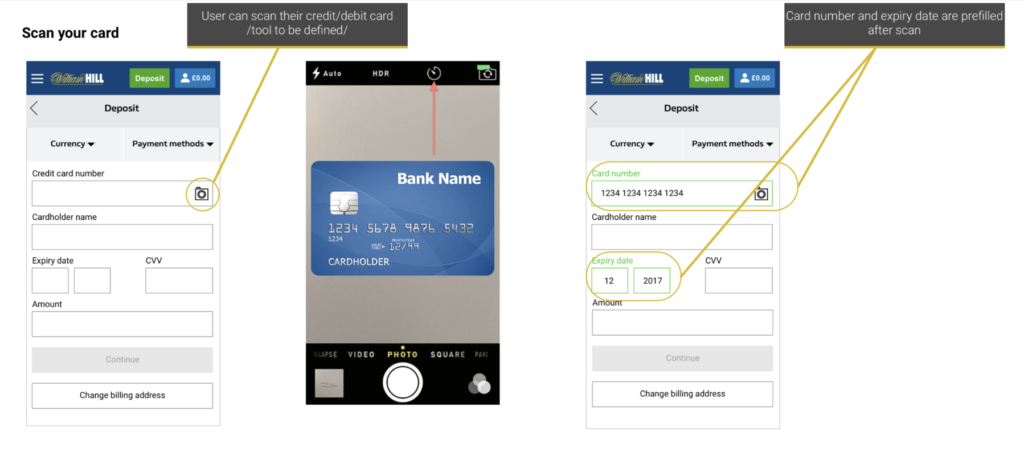
6. When filling out credit card details, several users were concerned whether the Year on Expiry Date should be YY or YYYY
7. We needed a unified way to display data and we had to let the user of the format.
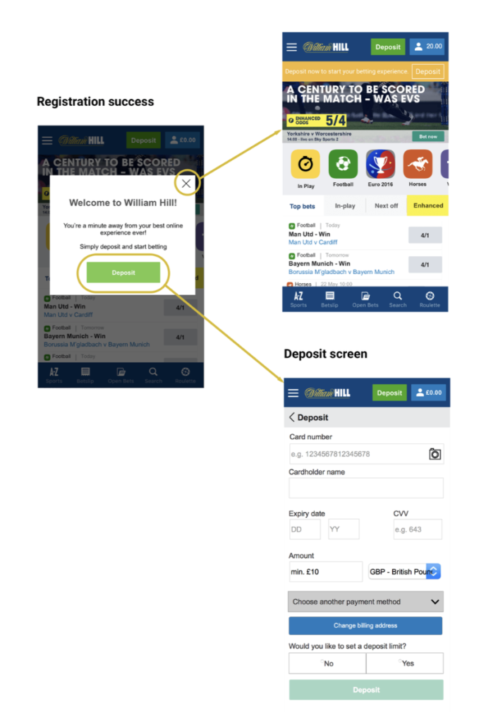
8. The confirmation splash screen was liked by many users as it provided clear feedback (Successful registration prompt)
9. We were not letting the user know the registration was successful. They also liked the option of choosing whether they would like to deposit now or at a later time as we were forcing them into depositing right away without a clear way of going back.